Mobile-First Listing Layouts: Where to Place Video, Audio, and Key Info
The First Screen Decides the Sale
Open any one of your live listings on your phone right now. Don't tap anything — just look at what's visible before you scroll. That's everything a buyer sees in their first three seconds. If your hero photo, price, and a clear next action aren't all visible on that first screen, you're losing buyers who never scroll.
More than 70% of marketplace traffic on eBay, online auctions, Etsy, and resale platforms is now on mobile phones — and on the smallest screens that number is closer to 85%. The desktop layout you remember from 2015 is irrelevant. The phone screen is the listing.

The physical reality of mobile is brutal: the visible area on a typical phone is about 6 inches tall. Your listing title, the seller's primary photo, and maybe one to two lines of text fit in that area. Everything else — your description, your media player, your shipping table — is below the fold. Buyers have to scroll to find it, and many won't.
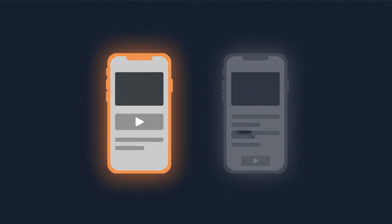
The 5-Zone Mobile Listing Layout
Every listing that converts well on mobile follows roughly the same five zones, in this order from top to bottom:
- Hero photo + title + price (auto-rendered by the platform — you don't usually control this).
- A one-line summary of what the buyer is getting. Single sentence, no fluff. "1969 first-pressing UK Mono LP, audio sample below." This is the hook that justifies the scroll.
- Your media — product video, audio preview, or both. This is the next-most-valuable real estate on the page. We'll cover placement in detail in the next section.
- Condition details and specs. Bullet points, no paragraphs. Buyers want to scan, not read.
- Shipping, returns, and trust signals. Last, because anyone reading this far is already interested.
This ordering reverses what many sellers default to. The instinct is to put shipping policy and seller terms at the top because they feel important. They're not — to a buyer who hasn't decided yet, they're noise. Move them to the bottom and let the product carry the top of the page.
Where to Put Your Product Video
If you're embedding a product video, the right placement is directly under the title and summary, before anything else. Not buried in the middle of your description. Not at the bottom "in case they want more." Top.
Why: video is the closest thing to handing the buyer the item. Photos answer "what does it look like?" Video answers "how does it move, sound, fit, work?" A buyer who sees the video early forms a much stronger purchase intent than one who reads three paragraphs first and then watches.
Three concrete placement rules:
- Within the first two zones (above the condition specs).
- One video, not three. Multiple embeds slow the page and dilute attention. Pick the most decisive 30 to 60 seconds.
- Auto-play muted, if your platform allows. Buyers on mobile are often in public; muted autoplay gets the visual engagement without disrupting them. Tap-to-unmute is the standard pattern.
If you're using eCommercePlayer, the embed is a single line of HTML you paste into the description. It works on every marketplace that allows HTML in descriptions, and it's mobile-responsive by default. Free plan covers 5 clips, which is more than enough to test the placement theory on your top listings.
Where to Put Audio Previews (For Vinyl, Instruments, Audio Gear)
If you're selling vinyl records, musical instruments, audio equipment, or anything where sound is part of the value, audio belongs in the same prime real estate as video — right under the title and summary.
For a vinyl seller, the audio sample is the listing. A buyer looking at a Northern Soul 7-inch isn't going to commit $40+ on a photo of the label. They're going to commit on the first 20 seconds of the track. Hiding that sample below your shipping table costs you sales every single day.
Practical placement tips for audio:
- Use a player that loads instantly. Buyers won't wait six seconds for a Flash-style legacy widget. Pick something that streams.
- Sample length: 20 to 60 seconds. Long enough to recognize the track, short enough that you're not handing out the whole song. Most vinyl sellers find 30 seconds is the sweet spot.
- Pair the player with the side-A photo, not the back-cover photo. Visual + audio together is much stickier than either alone.
We wrote a longer post specifically on this for vinyl sellers: see How Northern Soul Vinyl Sellers Use Audio Previews to Sell More Records.
Three Mistakes That Push Your Best Info Off-Screen
Once you know what should be at the top of a mobile listing, the next question is: what's pushing it down right now? In our reviews of seller listings, three patterns show up over and over:
1. The wall-of-text intro. A long paragraph about your store's history, your shipping policy, or a generic greeting. Every line you write at the top is a line that pushes the buyer's decision further down the page. Cut all introduction text. Start with the product summary.
2. The giant shipping table. A 6-row HTML table listing every country you ship to and every postage option. On mobile this stack becomes an enormous scroll wall. Move it to the bottom; most buyers only check shipping once they've decided they want the item.
3. The legal disclaimer banner. "All sales final. Items sold as-is. No returns after 30 days." Often duplicated in three places, all bold, all near the top. The platform already shows your returns policy. Repeating it in big text just makes you look defensive. Trim to one short line at the bottom, or drop it.
Fix those three and most listings gain 1-2 vertical screens of useful real estate above the fold — which is where the media, the price, and the buyer's decision all happen.
A Two-Minute Self-Audit
Open your top three listings on your phone right now. For each, answer:
- What's visible before you scroll? Hero photo + title + price + a one-line summary? Or a paragraph of seller copy?
- How many scrolls until your video or audio player appears? More than one is too many.
- Where's the shipping table? If it's above the media, move it.
- Does anything important live below your full description block? It's invisible. Move it up or cut it.
If you fix even one of these on every listing, you'll get more buyers to the media — and the media is what converts.
Related Articles
Ready to add media to your listings?
Create your free account in under a minute. No credit card required.